Embracing the present moment and the trends taking us into the future that we desire, Asian Paints ColourNext unveils Colour Trends for 2021, the Colour of the Year and the Wallpaper of the Year, offering direction and inspiration for design.
After studying colours and their myriad influences on lifestyle in India, Asian Paints ColourNext, the most prominent authority on colour and design trends in India, unveils the four Colour Trends of 2021 – Habitat, A Home New World, Felicity, Z Futures. Asian Paints ColourNext puts together a comprehensive forecast of colours, materials, textures and finishes for those who design for India since 2003. Along with this, Asian Paints announces the most anticipated, Colour of the Year – CHERISH.
Speaking on ColourNext, Amit Syngle, MD & CEO, Asian Paints Limited said, “The ColourNext trends and Colour of the Year are awaited with much excitement and anticipation every year. Various experts from the field of interior design, architecture, product design, textile and fashion, as well as marketing and technology, scout the country and the globe looking for inspiration and influences that can resonate with an Indian audience at large. While the four new trends have especially been curated keeping in mind the new life and the distinct outlook towards everything post lockdown, Cherish as a colour is sure to create a wave in the vast and influential world of design and brand marketing.”
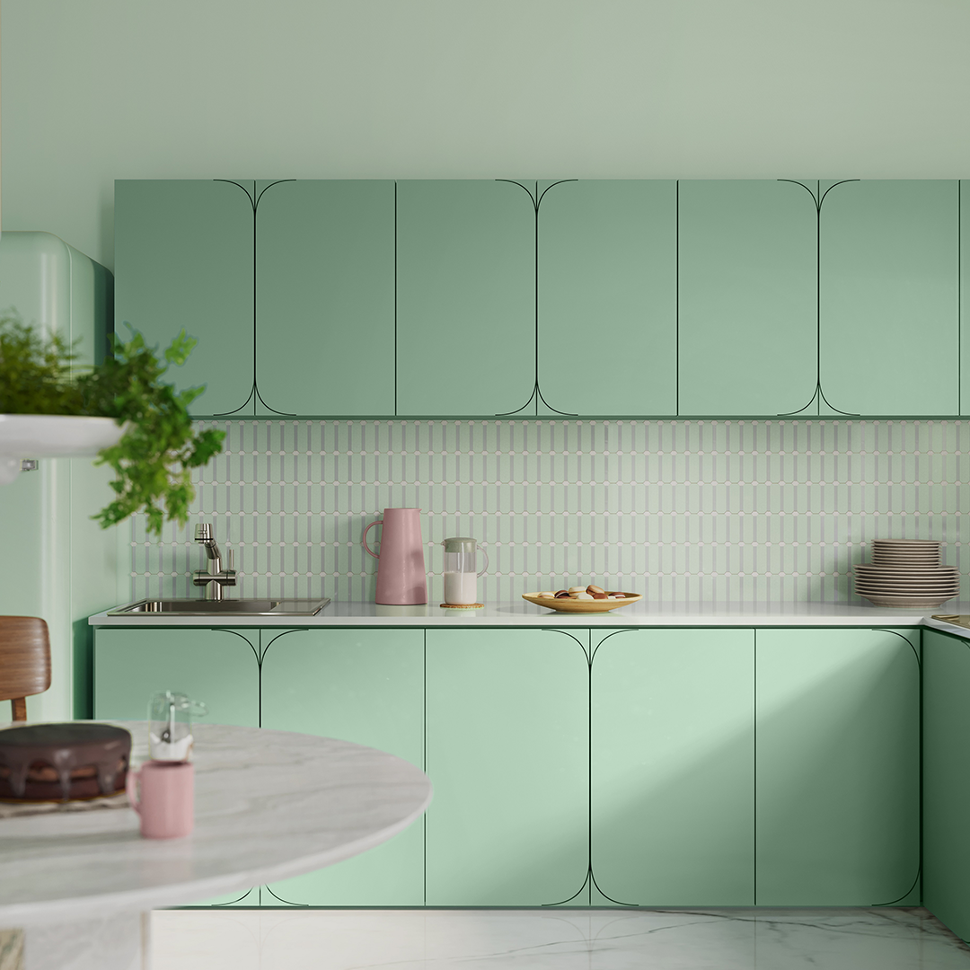
The Colour of the Year, Cherish, is a restorative yet effervescent shade that’s both enduring and uplifting. While 2020 taught us many hard lessons and seeking refuge may have been our most natural response, there’s also a need to be present in the ‘now’ and make the best of what it has to offer. Cherish (also known as the shade Ivy League) makes you appreciate the fleeting joys of life. It is a nurturing, humble and fresh colour that restores a sense of balance. The mint green shade, neither too warm nor cold, nudges growth while a hint of blue revitalises one’s mood. Whether it is the creation of beautiful concepts, products, or objects d’art, Cherish is worth celebrating in this moment, and the next moment, and the one after that.
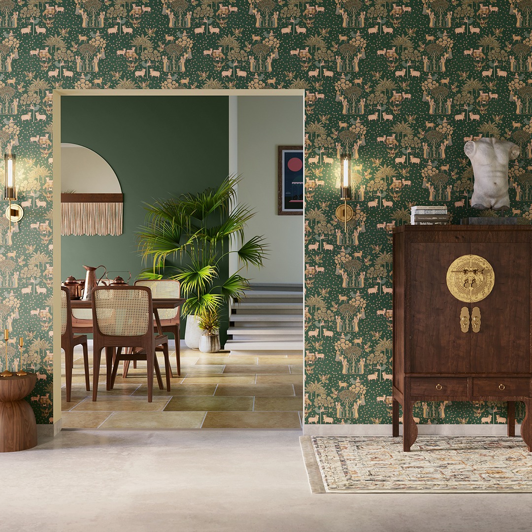
2021 is the year in which we remind ourselves that life is precious and every moment is a chance to celebrate it. Asian Paints Wallpaper of the Year, therefore, is the exquisite and timeless Jaipur Gemini. The past flows into the present through the stately stripes of Jaipur Gemini reminiscing royal hunting tents and their lavish decorations. Strength and positivity emanate from this radiant design reminding us that life hurries on so we must slow down and breathe in the beauty around us.
The four colour trends for the year 2021 are:
1. Habitat
As we emerge from this pandemic we find new ways to co-exist with the world around us. Habitat represents responsive, optimistic solutions that bring a sense of balance to the world. The palette for Habitat stems from a state of humility and seeking a balance with nature. The warmer intermediate spectrum represents a feeling of compassion, while the subtle grey overlay gives a murky, mature tone to the colours. Earthy shades of green and brown take inspiration from forests, moss-laden barks, stones and weathered materials. The neutral shade bridges the absorbing nature of these shades and the optimism of yellow and teal – shades that hint at sunlight and water, without which life couldn’t exist.
2. A Home New World
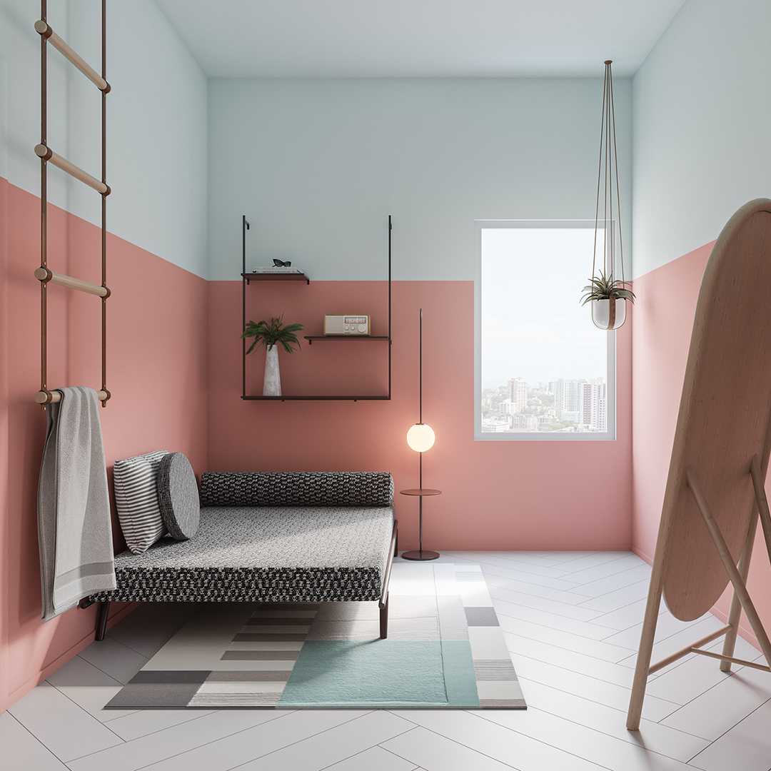
Catalyzed by the pandemic, our home has become an entire ecosystem where our otherwise separate worlds collide. Thus, we will see homes evolving to accommodate more than the usual. Caught in the frenzy of everyday life while staying indoors, the cooling colour palette of A Home New World uplifts your space and your mood; a daily dose of inspiration and something to pleasantly distract you from the routine. Fresh and punchy colours instantly jolt your energy while the deep and resolute dark blue, and a clear light grey provide the much-needed positive respite. Versatile neutral browns hold the palette together like those mid-day pauses that help you centre yourself.
3. Felicity
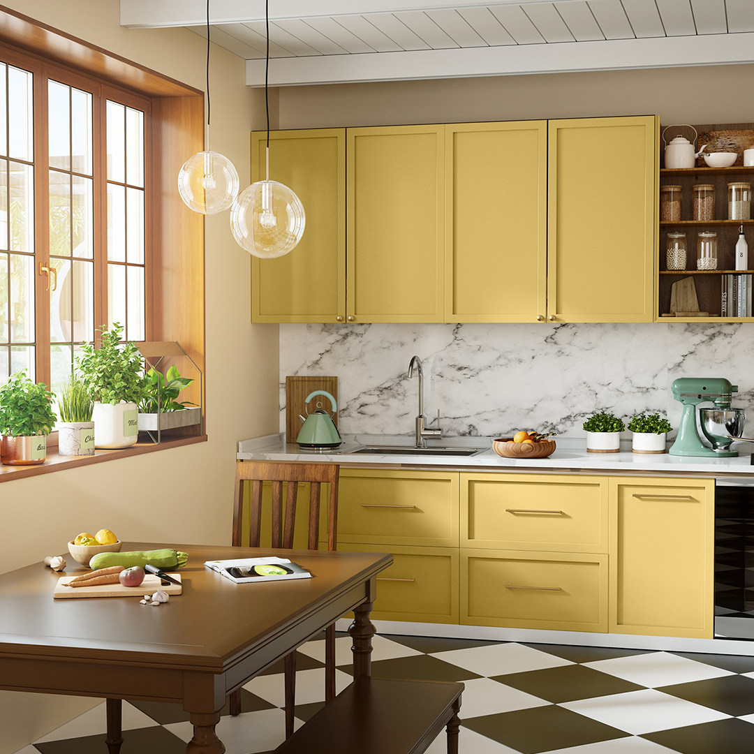
Felicity reflects a change in behaviour – a conscious choice to consume things that possess real value over flaunt value of an ephemeral nature. We now look for timelessness, long-lasting usage, clarity in form and function and an engineered-yet-crafted design. There’s a timeless charm to the palette of Felicity, made of colours that have endured over a long period of time and yet unwaveringly appeal to us. Classic colours that have a dense and absorbing quality are balanced by pale dye-like natural colours, giving the palette a sense of contentment and restfulness. The muted grey-blue, soft beige and airy sage green are inspired by mid-century graphics and patterns and the calm white holds the palette together.
4. Z Futures

Z Futures is inspired by the self-assured, liberal and fluid attitude of Gen Z – a youthful spirit of adventure mixed with the calm of domestic cosy. Unusual contrasts form the colour palette for Z Futures expressing the fluid, inclusive and tolerant mindset of Gen Z, open to diverse perspectives sans judgements. Light and airy colours when juxtaposed with dominant dark shades bring out the idea of assembled oddities, a trait we associate with the demographic. Fearless bright orange, confident bottle green and endless dark grey add vibrancy to the palette while under-appreciated light pink, powder blue and light grey exhibit the maturity and clarity of Gen Z.
Leave a Reply